The default keyboard on iOS is very bad.
It's a bit stunning how little effort they have put into developing this keyboard, considering how widely used it is.
It is arguably the #1 input method on earth, so I think it's worth putting some thought into possible improvements
Outlining The Issues
Layout
We're starting with QWERTY, so we know that there are many optimizations to be made here. Now to be fair, many of the things that make QWERTY so terrible on a regular keyboard become less of an issue on a smartphone where you are typing with your thumbs. But its letters placements still far from ideal - we can make huge improvements here.
Lack of Gestures
This is probably the most egregious issue. Multitouch is the the defining feature of the iPhone. Yet the keyboard has ZERO gestures available on it. The only possible exception is the spacebar cursor drag. This is the keyboard's best feature, and ironically it's one that I find many people don't even know about.
Size and Shape
The standard computer keyboard shape has simply been shrunk down and placed onto the screen. If we instead design this based on where are thumbs will most naturally be placed, we can probably find something better.
Placement of Non-Letter Keys
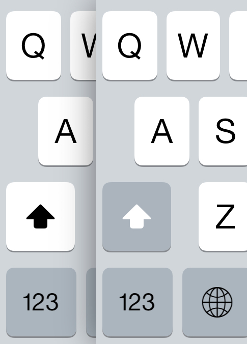
Finally the placement of important action keys, most notably Backspace, are very bad. Backspace is the key you hit more often that any other, and it is in one of the worst spots on the board, requiring you to tuck your thumb in and likely even reposition your hand slightly.
Many other common characters, like puncuation or numbers, are similarly poorly placed, requiring an awkward press of the "shift" key to access them on a second layer.
Design Goals
The goals with a smartphone keyboard are different from a regular keyboard, which makes this an interesting challlenge. On a regular keyboard, you generally want to have all your most frequent keys on the "home row", and most designs aim to maximize "inward rolls", as that is usually seen as the most comfortable action.
"Single Finger Bigrams" (consecutive keys which are pressed by moving the same finger from one spot to another) are given special attention to avoid. Often the hallmark feature of any new layout is how few SFBs it contains while typing.
But on a smartphone, you are only typing with your two thumbs. They are already very close together, not moving very far. If we had all the common keys right next to each other, then we would either have 1. several letters in a row hit by one thumb (SFBs), or 2. our two thumbs trying to operate in the same space and colliding with each other.
So the aim here is:
- High alternation
- Keys that are hit by opposite thumbs should not be near each other
- Most common keys should be in the spots that are easiest to hit
By distributing frequently used keys across the rows, we can optimize for thumb agility and minimize awkward thumb movement and collisions. For information on bigram frequency, as well as other letter stats, you can see my data analysis here
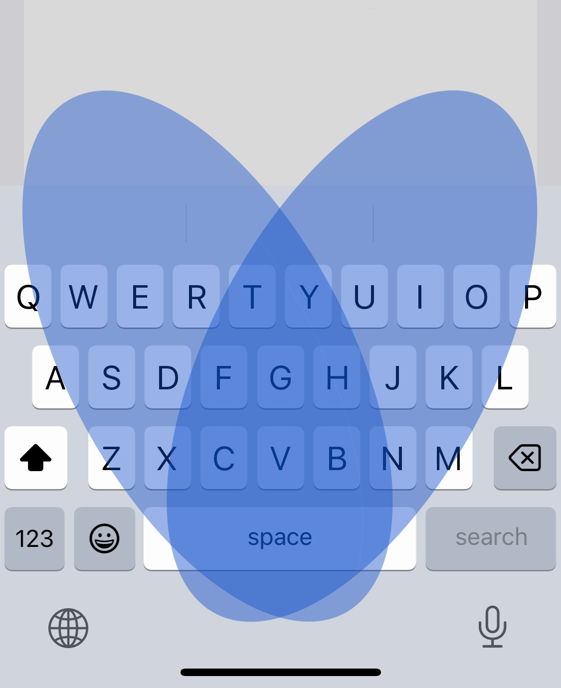
Finally, to decide what spots are easiest to hit we can follow the arc of our thumbs across the keyboard, gives us two mirrored, overlapping ovals.
Better Utilization of Gestures
Given that the standard iOS keyboard utilizes almost no gestures, so there is a lot of low-hanging fruit here. For example, a no-brainer gesture would be "swipe left across the keyboard to delete the last word". We will end up going with a more advanced approach, but that gives you an idea of the possibilities here.
An Extra Row
You may notice that the "reachability" diagram shows that we can actually reach above the top row of the default keyboard quite easily, in two specific spots. We can place a couple keys here in a new top row.
Avoiding Corners
Corners and edges of the keyboard are bad. They are hard to reach and can slow down the typing process, even make you reposition your hand occasionally. The letter P for instance is particularly bad. By relocating frequently used keys away from the corners, we can achieve a comfortable typing experience. Infrequently used letters can then be placed in these less accessible areas.
Larger Keys
It would be nice if the keys were larger, wouldn't it? But we have to fit a certain number of keys in there, so how can we do this?
Well... do you really need all those keys?
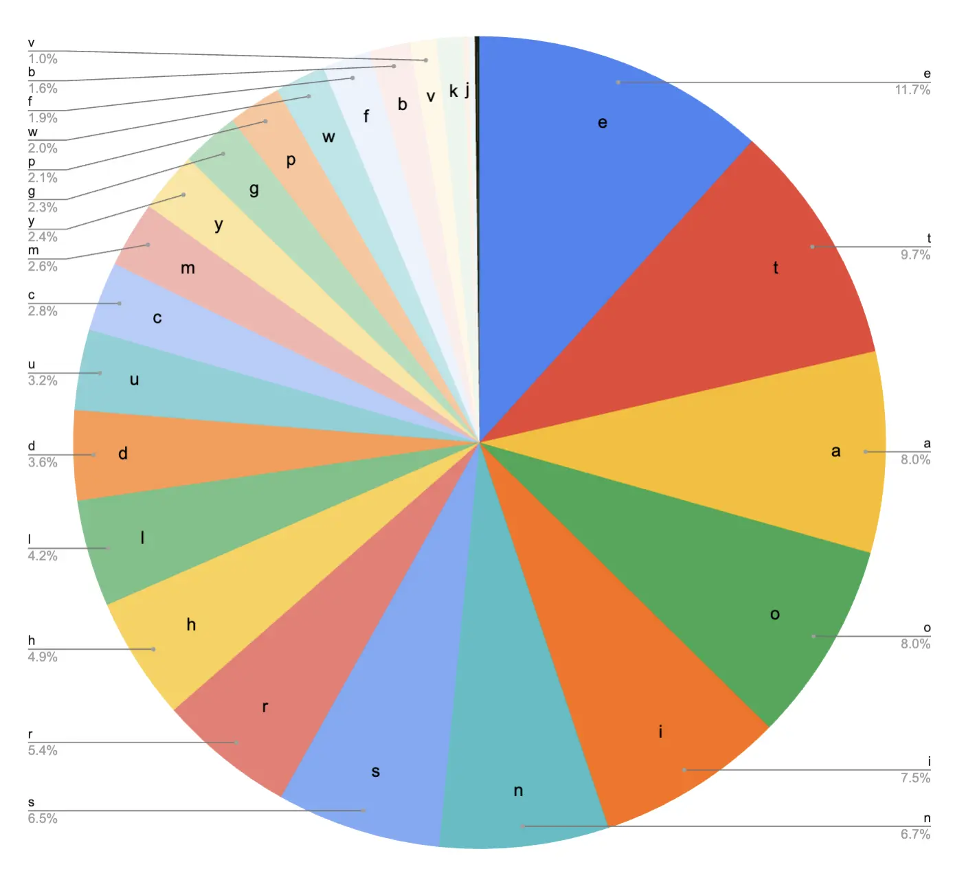
Probably not. Data shows that just 6 letters make up >50% of our typing. Conversely, four letters (X, J, Q, and Z) make up around 0.6%
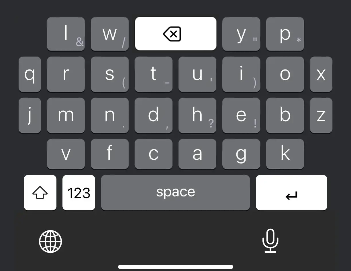
So combining the last two points, we can give these very rare letters extra small keys, and place them on the edges of the board, giving us some more room to make the rest of the keys larger.
Finished Keyboard
So here is our finished keyboard. It features high alternation, numerous swipe gestures, and larger keys for most letters.
Key Swipes
Each key has multiple swipes gestures. Swipe up on a key to get the capital version of that letter. Swipe down to get the puncuation mark displayed in the corner. Swiping left or right on most keys can give you a common word (or part of a word) associated with that letter. For instance swiping left on Y outputs "you", and swiping right on F outputs "from".
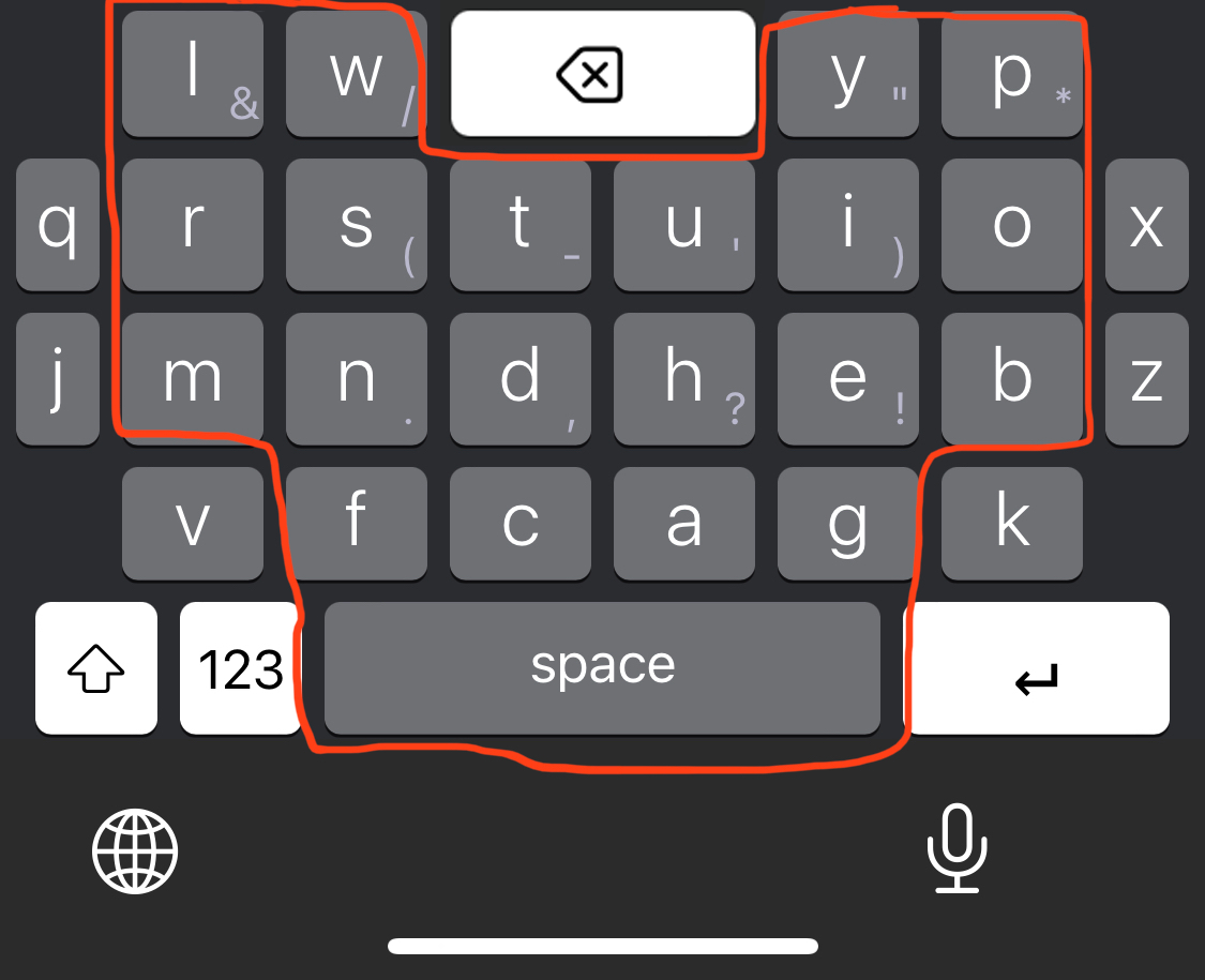
Better Backspace Key
Our backspace keys is now 2x larger. It is in a much easier to reach spot and can be hit by either thumb. Swiping left on the backspace key deletes the last word. Swiping down on the backspace key deletes the entire line.
Shift
Since we can type most punctuation marks with a swipe, we rarely need the "shift" key anymore. So we will banish it to the lower corner where the backspace button used to be.
Conclusion
Overall, after using this keyboard for about a month, I can say that it is significantly easier and more comfortable that the built-in keyboard. However, you really notice the absence of Apple's autocomplete (which they do not allow 3rd party keyboards to use). I was able to implement my own autocorrect and autocomplete, but they are simply not as good as Apple's, which is industry gold standard. But I do feel comfortable saying that given a better autocomplete with this keyboard, I would feel no reason to ever use the default keyboard again.